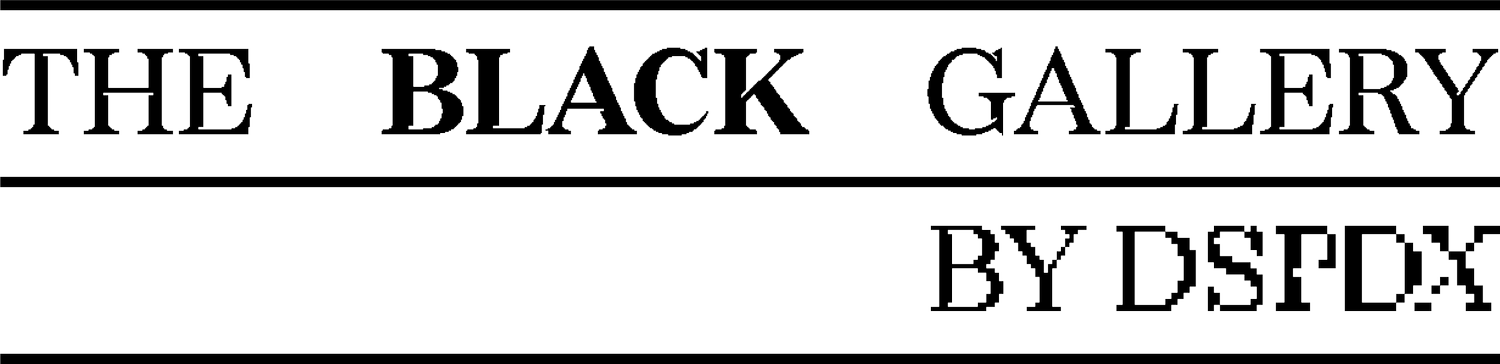

The Black Gallery identity uses Redaction, a typeface commissioned by Titus Kaphar and Reginald Dwayne Betts, created with Forest Young and Jeremy Mickel. An open source typeface, Redaction represents an intersection of history, the legal system, and social justice:
"By providing a range of grades from subtly analog to nearly illegible, the typeface nods to the transformation and marginalization that many people face in the criminal justice system today, and specifically, the role and responsibility of the author of text to be conscious of legibility as a signature of power.”
— from www.redaction.us
A Word From Omnivore
The use of Redaction for The Black Gallery identity aims to subvert the visual language of authority. The identity uses intentional open word-spacing to emphasize porosity as a form of accessibility. But the primary subversion comes from the varied letterforms themselves. Crossed-out lines of redacted text suggest systematic exclusion but also serve to circumscribe a space that is now Black. This creating of Black space is particularly resonant in the context and tradition of the gallery as a “white box.” The pixelated letterforms of Redaction re-encode an artifact of low resolution, replacing pixelation as a signifier of degradation with a new meaning and imbuing it with sense of social activism: a landscape of pixels articulates a language of collectivism. Here “degradation” is given new life as a signifier of social processes of transmission and transformation. The acts of copying, reproducing, and disseminating are embodied in the typeface as a symbol of community, history, and access.